Alerts
Alerts are used to attract user's attention for important information without interrupting the user's flow.
Example of Alert Bar without close button
Alerts are available in 5 types- success alert, error alert, warning
alert, primary alert, secondary
alert.
To use this alert just use class name alert
and also add class according to alert type- alert-primary,
alert-secondary, alert-danger, alert-success, alert-warning. (e.g.class="alert alert-primary").
You can copy html part
from below code snippet.
Avatar
Avatar can be used to show user's profile picture on profile information page, on navigation bar, in blogs grid items.
Example of Image Avatar
Avatar is available in 5 different sizes. You can use image in Avatar.
You need to include class
avatar and for size add class according to size avatar-xl-size avatar-lg-size, avatar-md-size, avatar-sm-size,
avatar-xs-size
(e.g. class="avatar avatar-lg-size")
Don't forget to add img-round or img-sqaure class
names for img element as per your need.
Badges
Badges are being used to display a notification count or status information
Example of Badges
We have 3 types of status badges that can be integrated with Avatars. You can show colors to show the online status of user. And to show cart or notification count, you can use text badge. Check code below to copy the html part as is.
This is example of h1 Heading with Badge New
This is example of h2 Heading with Badge Pending
This is example of h3 Heading with Badge New
This is example of h4 Heading with Badge New
This is example of h5 Heading with Badge Pending
This is example of h6 Heading with Badge New
Buttons
Buttons are also called as call to action. We have range of buttons and their states. You may use a tag or button element, you need to add respective classes, and you are good to go.
Example of Primary Button Styles
Whenever you want your user to click on a link or button, use primary style buttons.
Cards
Card are used to show user related data collectively, like product details.
Example of Different types of Cards
Card's image may have a margin or it can be full-bleed. By default card's
images are full-bleed. If
you want image to have margin, you can use default-container
class.
Copy below code and put your desired text and image and you are good to go.
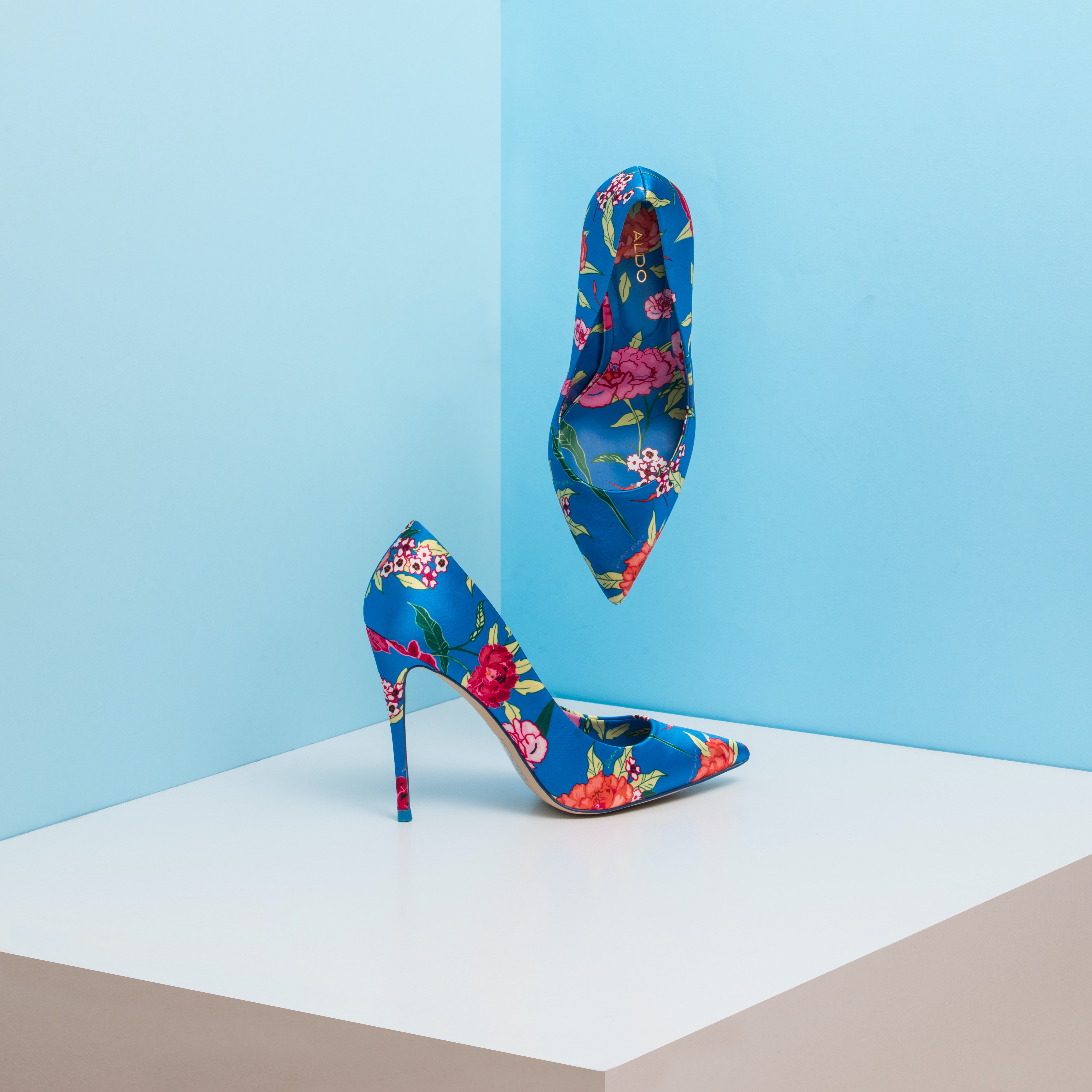
Artistic Weapon
Indian Mother's/Gf's Brahmastra
Will hit best when aimed for head with pointed heel.
Artistic Weapon
Indian Mother's/Gf's Brahmastra
Will hit best when aimed for head with pointed heel.
Artistic Weapon
Indian Mother's/Gf's Brahmastra
Will hit best when aimed for head with pointed heel.
Artistic Weapon
Indian Mother's/Gf's Brahmastra
Will hit best when aimed for head with pointed heel.
Black Holes
Black Holes deep dive!
Black Holes are really really black like for real.
Artistic Weapon
Indian Mother's/Gf's Brahmastra
Will hit best when aimed for head with pointed heel.
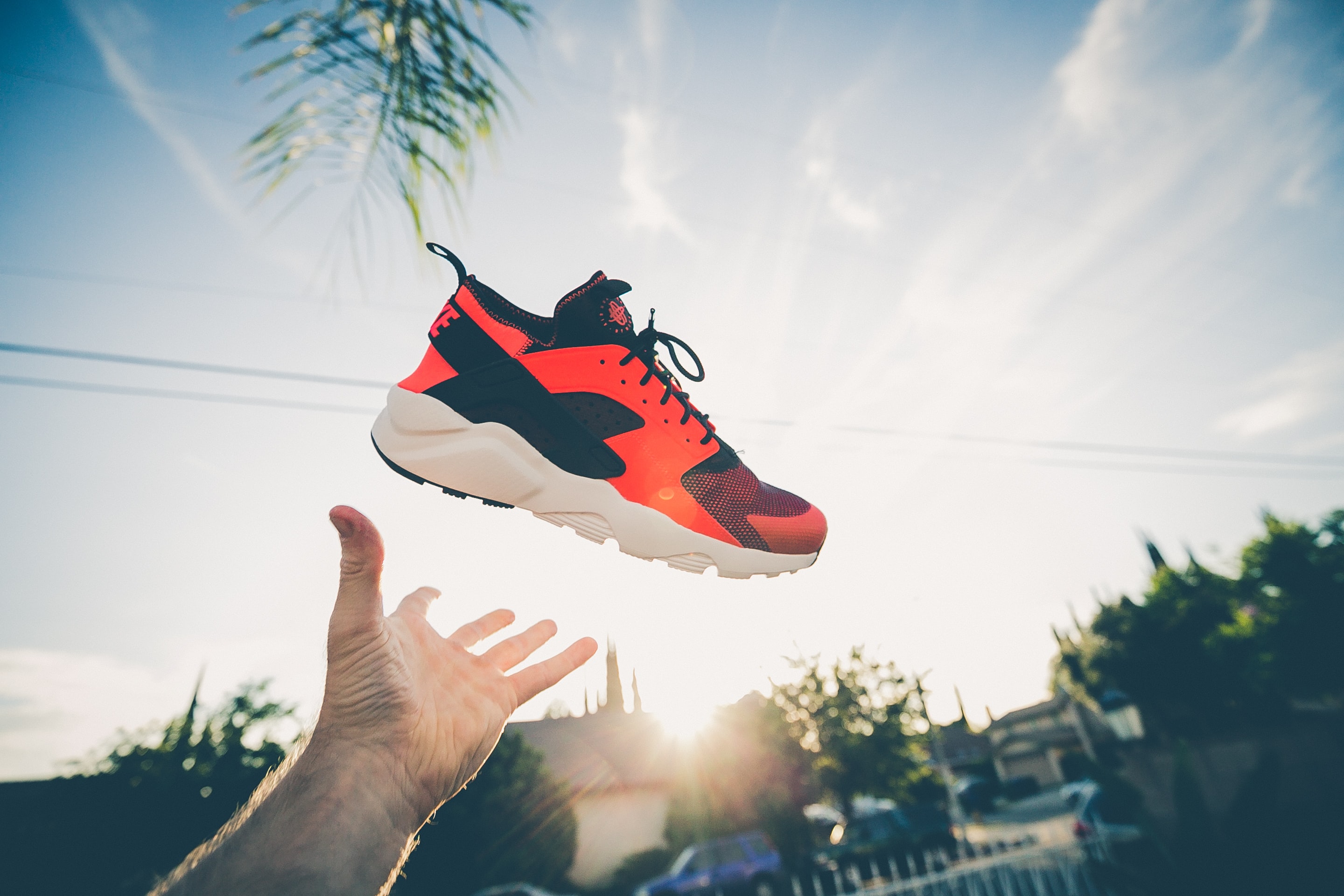
Images
Images can be responsive to fit the parent's width, and also can be customised to be round shaped
Example of Responsive Image
You can add class img-responsive to make your image fit the width of container. It's height will get adjusted by keeping the aspect ratio same. If you want to change the aspect ratio, you will have to crop the image.

Inputs
Various Types of Input Elements are there.
Example of Input Elements
You can add class input, input-default to use input elements of different types wherever it is required.
Lists
Lists can be used at so many places, navigation bar, stacked notifications, article pages, etc.
Example of Unordered and Ordered Lists
Add class according to bullet style. Copy html code below and add your desired list items.
- List Item 1
- List Item 2
- List Item 3
- List Item 4
- List Item 5
List Heading
- List Item 1
- List Item 2
- List Item 3
- List item with numbers
- List item with numbers
- List item with numbers
- List item with numbers
- List item with numbers
- Reversed list item 1
- Reversed list item 2
- Reversed list item 3
- Reversed list item 4
- Reversed list item 5
Typography
Check out below text utilities.
Example of Heading text
For heading u can use h1, h2, h3, h4, h5, h6 elements.
The same font-styling is present for class names h1, h2, h3,
h4,
h5, h6 class. You can add one of these classes to style the text.
Example of Heading - 1
Example of Heading - 2
Example of Heading - 3
Example of Heading - 4
Example of Heading - 5
Example of Heading - 6
Extra Small Text
Small Text
Medium Text
Large Text
Extra Large Text
Left Aligned Text
Center Aligned Text
Right Aligned Text
Primary Colored Text Example
Secondary Colored Text Example
Success Colored Text Example
Warning Colored Text Example
Error Colored Text Example
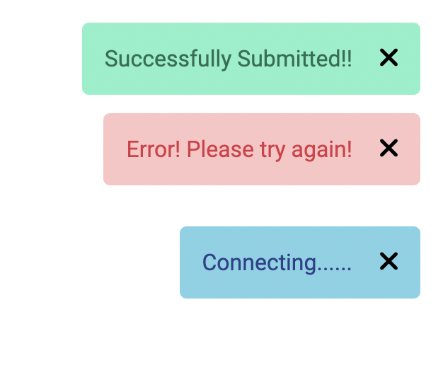
Toast
This component can be used for toast or snackbar component. Toast is mostly used to show feedback message. Snackbar is to used show message that need user action
Example of Toast
Add toast class to wrapper. Toast has 3 themes, for error, success, warning, add toast-success, toast-error, toast-inform class to style the theme.
Rating
Rating components can be used as read-only badge or in reviews section. Can be used in reviews section as form too.
Example of read-only ratings
There are two types, input read-only and badge
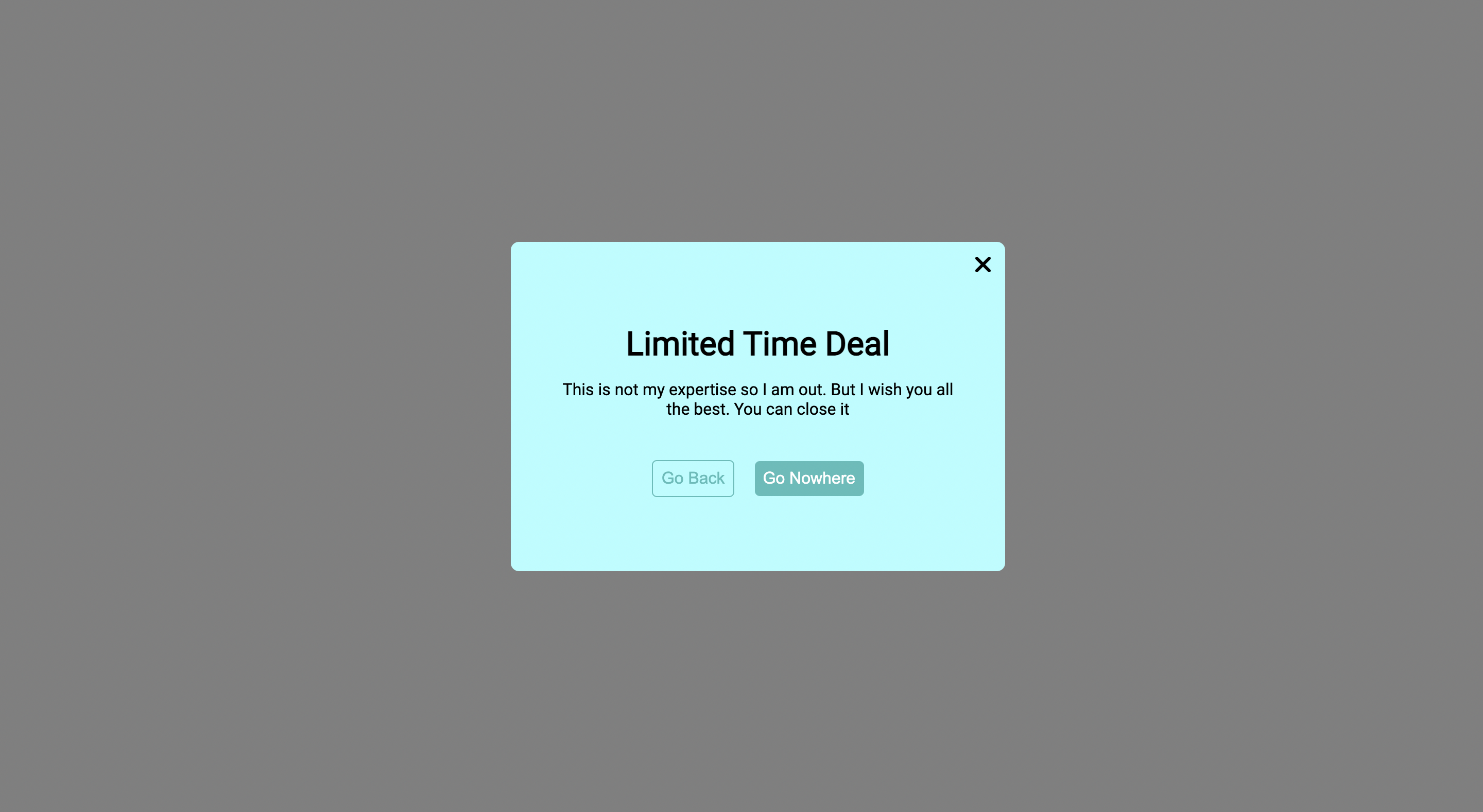
Modal
Modals are positioned over everything else in the document and remove scroll from the page. It gets closed only with close button on modal pop-up.
Example of Modal
You need to have wrapper div modal-interstitial class. Inside
that, you can wrap content inside div.modal-content
that you
need to show in pop-up.
Check out below code.
Slider
Sliders are used to decide range for something like sound in videos, price in shopping sites, etc.
Example of styled slider
Grid Simplified
Use grid when you want sections in view. Check below some examples of side by side cards.
Examples of side by side (50:50), (70:30), (30:70) and grid-4-column-layout for product listing page layouts
Add grid-50-50-layout, grid-70-30-layout, grid-30-70-layout, grid-4-column-layout class on wrapper divs.
Artistic Weapon
Indian Mother's/Gf's Brahmastra
Will hit best when aimed for head with pointed heel.
Artistic Weapon
Indian Mother's/Gf's Brahmastra
Will hit best when aimed for head with pointed heel.
Artistic Weapon
Indian Mother's/Gf's Brahmastra
Will hit best when aimed for head with pointed heel.
Artistic Weapon
Indian Mother's/Gf's Brahmastra
Will hit best when aimed for head with pointed heel.
Artistic Weapon
Indian Mother's/Gf's Brahmastra
Will hit best when aimed for head with pointed heel.
Artistic Weapon
Indian Mother's/Gf's Brahmastra
Will hit best when aimed for head with pointed heel.